Slack Searchbar Redesign
Challenge
Slack is an application based on the premise of human to human interaction. Teams work together, messages are exchanged, and in a very short amount of time, members can communicate an abundant amount of ideas with each other in the platform. Nevertheless, as ideas spread, they become hard to manage. Inboxes flood, channels become hard to manage, and users might become lost within the vast sea of information that they have to deal with.
This is why features like “Search” are so critical. It provides users with a means to narrow down and isolate information that they specifically need. I believe that since the feature is so important, it might be a good investment to improve upon it.
Things I would like address are:
1. The over-complication of search specifiers.
2. The confusion created between the channel and direct message, and the general message search fields.
Search Specifiers
I was surprised by the amount of people that have telling me that there are ways to specify search results. Personally, I use the search modifiers “from:” and “to:” a lot, but I can definitely agree that these features are not very discoverable. While researching Slack for this redesign, I also learned that there were more modifiers such as “before:”, “during:”, and more. This surprised me even more. I use Slack on a daily basis, and yet I don’t even know half of the search modifiers.
Discoverability with the search field seems to be a big problem, so rather than hiding all of the modifiers and filters with undiscoverable text commands, my solution is to make them more accessible by displaying them. If Slack were to have a filter section where people could be presented with their advanced search options, there would be more awareness of search capability. Knowing how to search for something could be the difference between finding a critical update and being left in the dark, so deliberating these filters will have serious benefits for Slack users.
Search Fields
Another annoyance that I experience is searching in the wrong search field. Something that I constantly do is look specific messages that people have sent in the left-hand search field. I understand that even though the words “Jump to...” may not be descriptive of how the field functions, however one can argue that the search field is grouped in the channels and direct messages section. Despite this, after having used Slack numerous times, I still make the same errors.
The problem with having two fields is that western cultured individuals scan from left to right, it is inherent in how we read information. And while people are scanning, they gravitate towards the first search field that they spot, which may or may not be the field they intend to use (assuming they can differentiate the purposes of each field).
My solution to this confusion is to create a single field that is capable of searching for channels, direct messages, and general messages. This would simplify the user experience as all search mechanics are in one location.
Current State of the Slack UI
As seen, there are two search fields, one on the left-hand side of the screen (which I often use mistakenly) and the other on the right-hand side of the screen. Having two ambiguous fields in such distant locations can cause a lot of confusion for users.
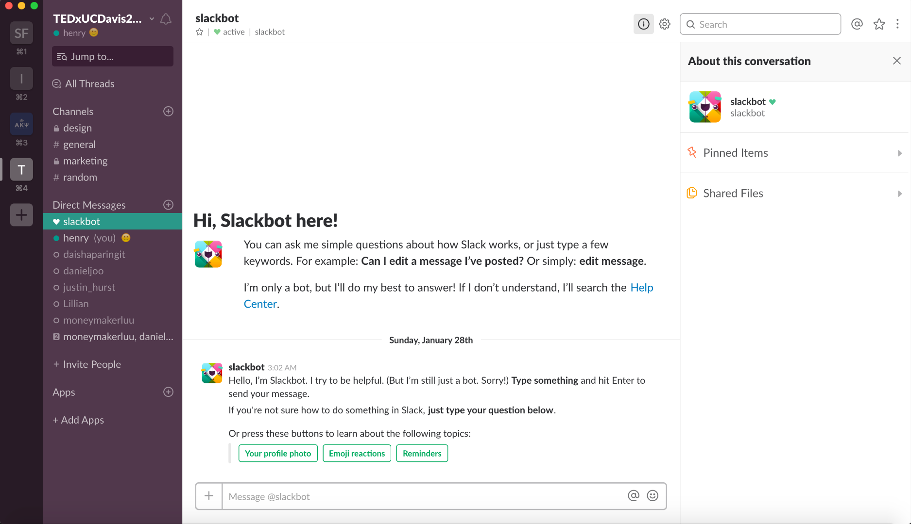
Exploring Slack’s Search UI
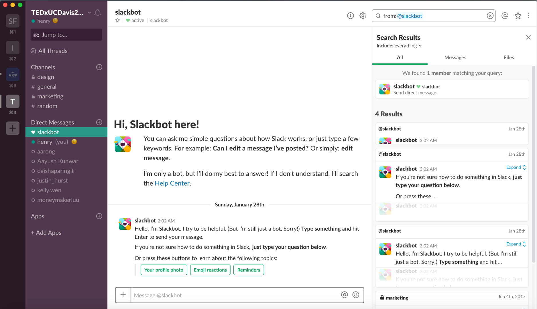
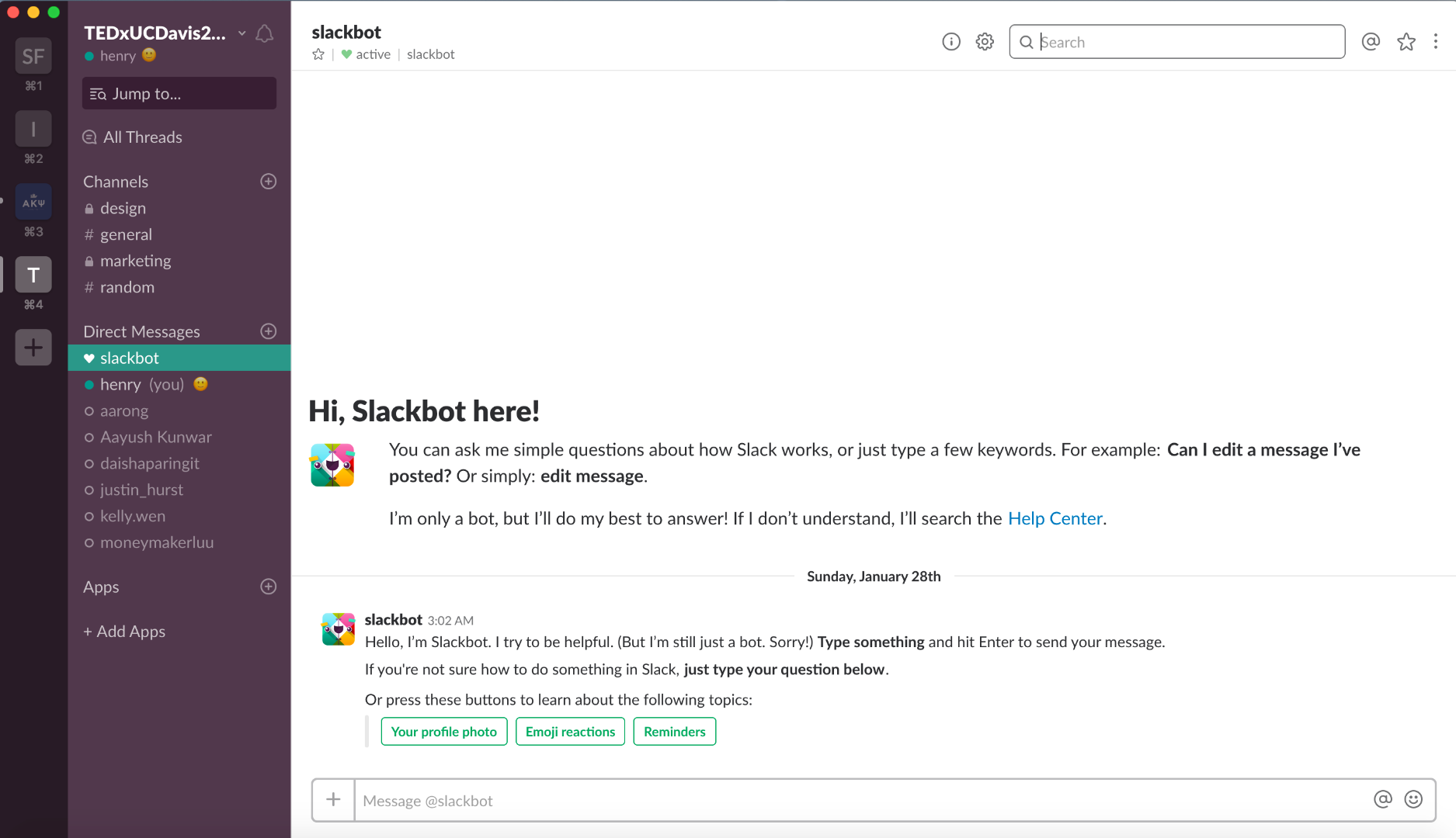
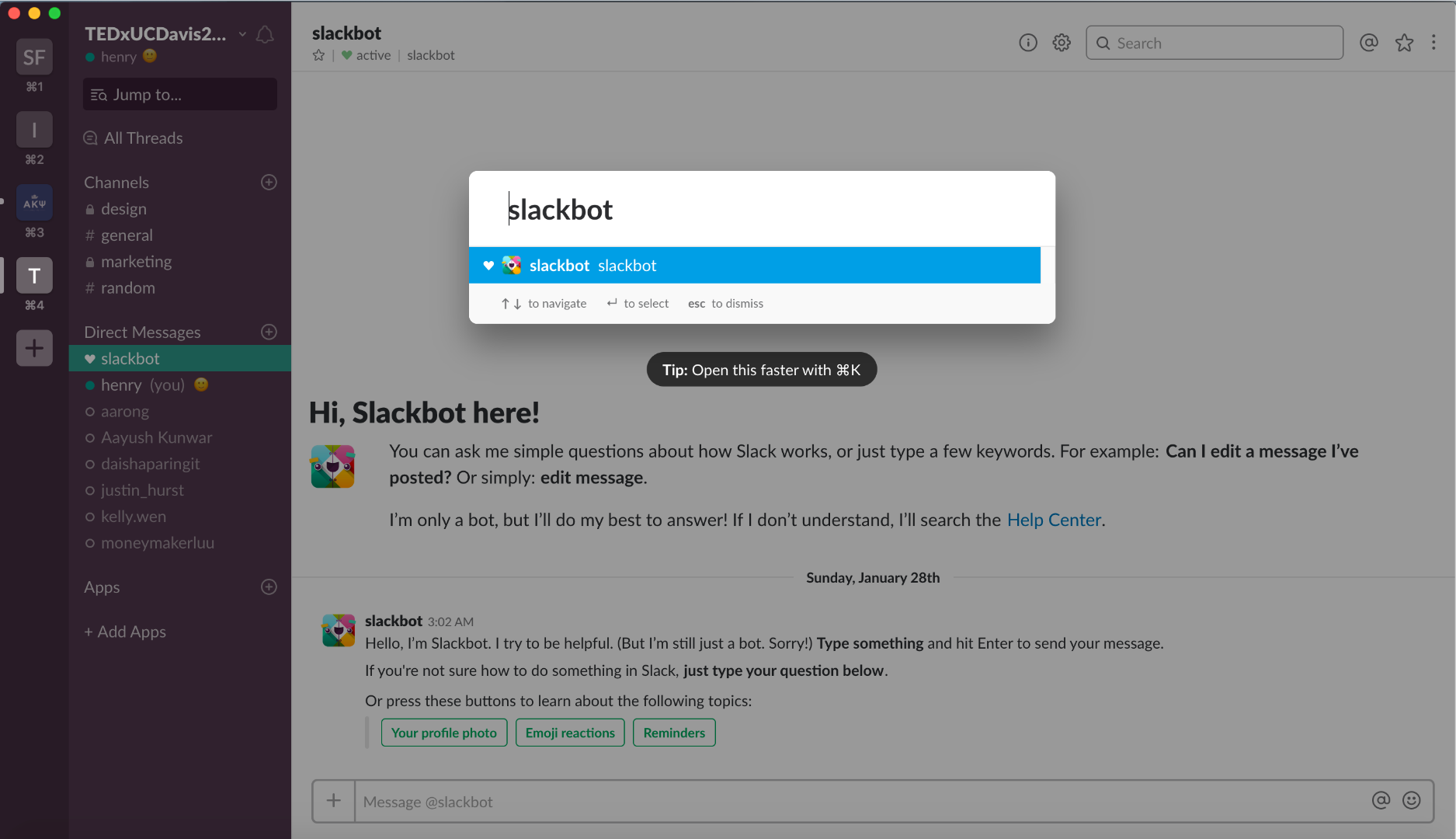
As seen in the next couple of pages, it is annoying that each of the search fields display your information at different areas of the page. If information was in the same area all of the time, users wouldn’t have to keep jumping around the page to find what they want.
Searching: “from:@slackbot” on the right-hand search field gives you this display:
Searching: “slackbot” on the right-hand search field gives you this display:
Entering: “slackbot” on the left-hand search field gives you this display:
Redesign
Based on the discontentment outlined earlier, here is my redesigned search tool:
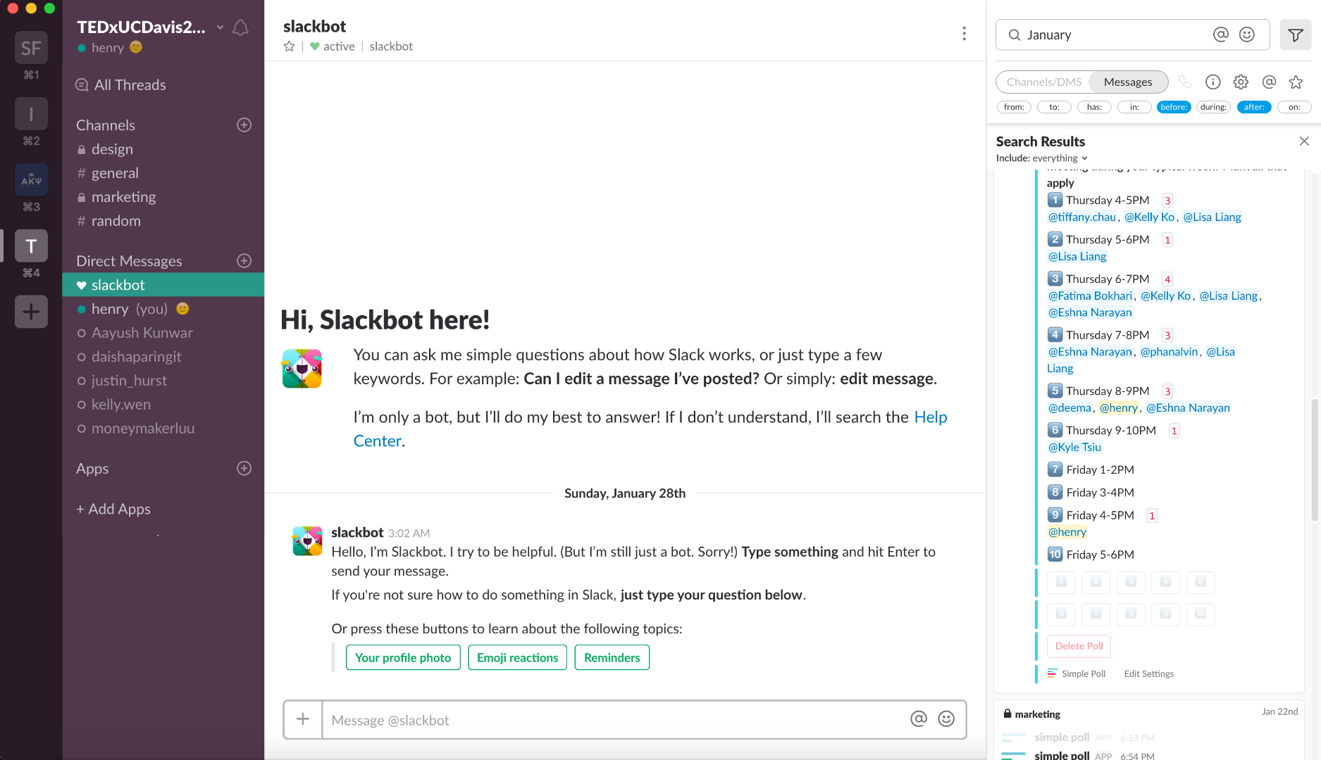
I removed a lot of the search signifiers/icons that are used to filter results and have put them within the new filter section seen in the top right corner of the display.
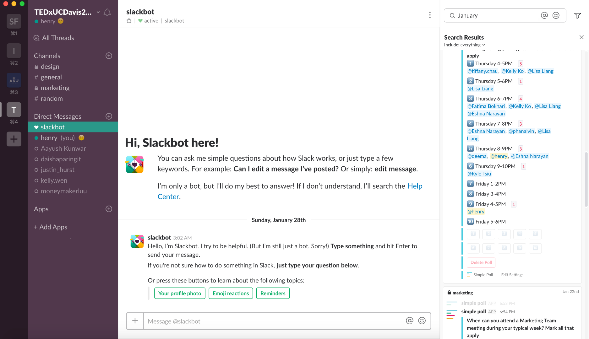
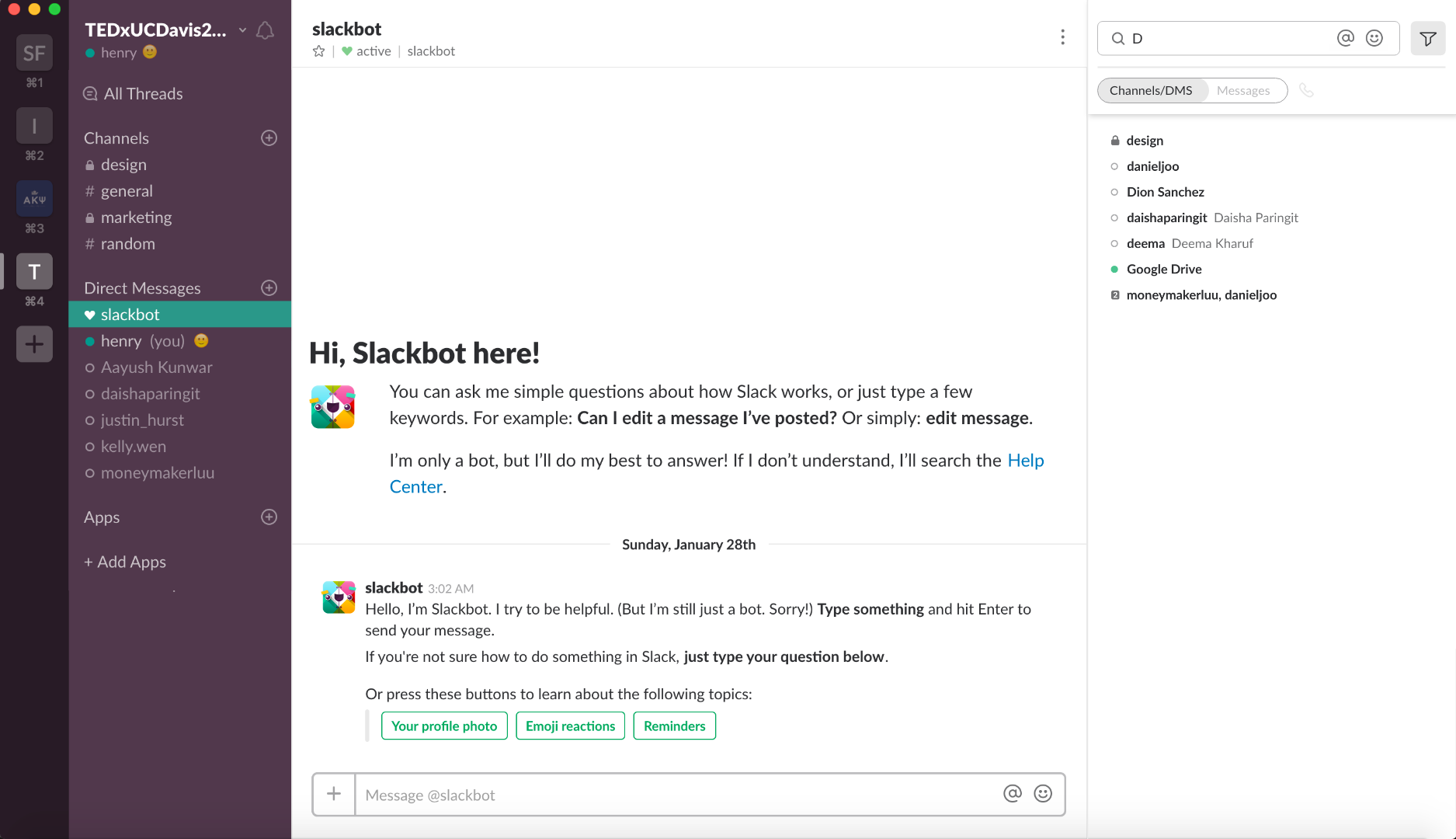
By expanding the filter section, you can select one of two search options: Channels/DMS, and Messages.
With the Messages Field, all actions and filters are presented to users. This way they are able to maximize the search potential that slack has to offer.
With the Channel/DMS Section, all results are contained within the right-hand results container. This creates consistency for the user, ensuring that they won’t have to jump around screen area to find information.
Solution
By grouping all of the search capabilities and information, I believe that users will have a better user experience. All user goals concerned with searching are now achievable in one area.